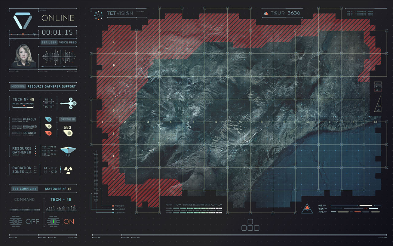
Sci-Fi movies today often present viewers with amazing futuristic UI’s that are beautifully animated, and always have the exact information the character was looking for. These futuristic interactions offer a glimpse into the possibilities of how we may one day interact with the devices around us. And there are a lot of devices around us. The UI may not always become a reality, but they certainly offer inspiration and open the box of what could be created one day.
Exploring motion graphics in films is a technical study of what is realistic in terms of interactivity, usability, and visual appeal, and what is just eye-candy for the viewers. UI Animations captivate the viewer, draw their interest and leave them in awe of the fictional technology. In real life, animations can be used to guide the attention of the user, but with the art of being subtle and almost invisible to the user.
Here is a collection of futuristic UI elements for your inspiration:
Gmunk – Oblivion Motion Graphics
Gmunk uses a dot grid to align the graphical details, this results in a consistent and fluid look for all the motion graphics work in Oblivion. This design thinking is clear in much of Gmunk’s motion graphics work and is directly relatable to web application design. Where the grid layout is the foundation for organizing any web components on a page.
“Circles, dots and lines… and type, just arranged in really complex ways. It’s the grid that defines it all. That’s the foundation of all UI work”
Bradley “Gmunk” Munkowitz
There are some great inspirational resources and assets provided at https://gmunk.com/OBLIVION-GFX. Here is a montage of the motion graphics by Gmunk for the movie Oblivion:
GM Concept UI
A concept UI by Gmunk, completed for the Cadillac concept car the Elmiraj. It is a driver console and touch screen UI. While it was done in 2013, it is still a relevant look into the future of Car UI, and how far away we are from this reality. The design stresses real-world functionality, which allowed for a beautifully clean and “easy to operate aesthetic”, which a driver would expect from a vehicle.
Perception
Perception, is a company creating cutting-edge science fiction movie UI experiences, and transforming those ideas into concept technologies for real-world industries. A process they call “Science Fiction Thinking”, meant to amplify Design Thinking and provide a clear framework.
In films, futuristic UI’s are designed to be “in-your-face” noticeable and forward-looking, while the real-world counterpart is much more functional and invisible. This allows companies to examine how the innovative concepts found in film can be leveraged in their products.
The Martian – UI Reel
Set in the not so distant future, the UI elements in ‘The Martian’ are very clean, clear, with very little fluff. This is a very realistic approach to how the not-too-distant future interfaces may function. The design is flat and with no gradients, but with very clear and contrasting colors.
Animated Futuristic UI Design Elements
Here is a great video compilation of futuristic design elements, many have a familiar look and pull from the work of Gmunk. There are some great patterns and animations, the video is organized into a few sections, some things to take note of:
- The color palette, teal and orange, a common theme
- The animations as elements open, close, move
- The ‘Time’ collection would make for amazing real-world watch faces
Final Thoughts
A lot of thought goes into motion graphics, from the fluid animations to the contrasting colors. While created to exist in fictional worlds, is there a limitation from making these animated UI elements a reality.


